
Why Substack Looks So Different Depending on How You Read It
A Reader’s Guide to App vs Browser

If you’re reading something on Substack and thinking: “Why does this look completely different from what someone else is describing?”
You’re not imagining things.
Substack is not just one experience.
From a reader’s point of view, there are two very different ways to consume the exact same content.
Reading Substack in the App:
Feed-First, Minimal, Social
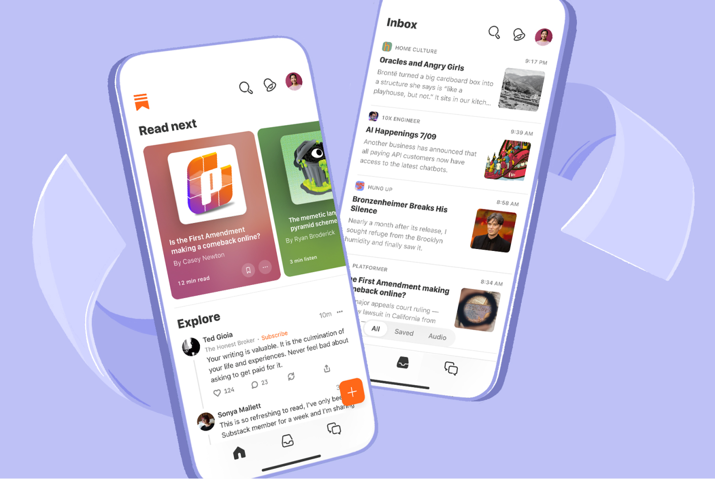
The Substack app is designed to feel like a reading feed, not a website.
When you read in the app:
Posts appear in a scrolling timeline
Layouts are standardized
Navigation is minimal
Everything looks… the same
This is intentional.
The app:
removes sidebars
hides menus
strips most layout choices
prioritizes text and conversation
From a reader’s perspective, it feels closer to:
a magazine feed
or a calmer social platform
or email without the inbox chaos
You’re there to read, not explore a website.
Reading Substack in a Browser
Website-Like and Structured
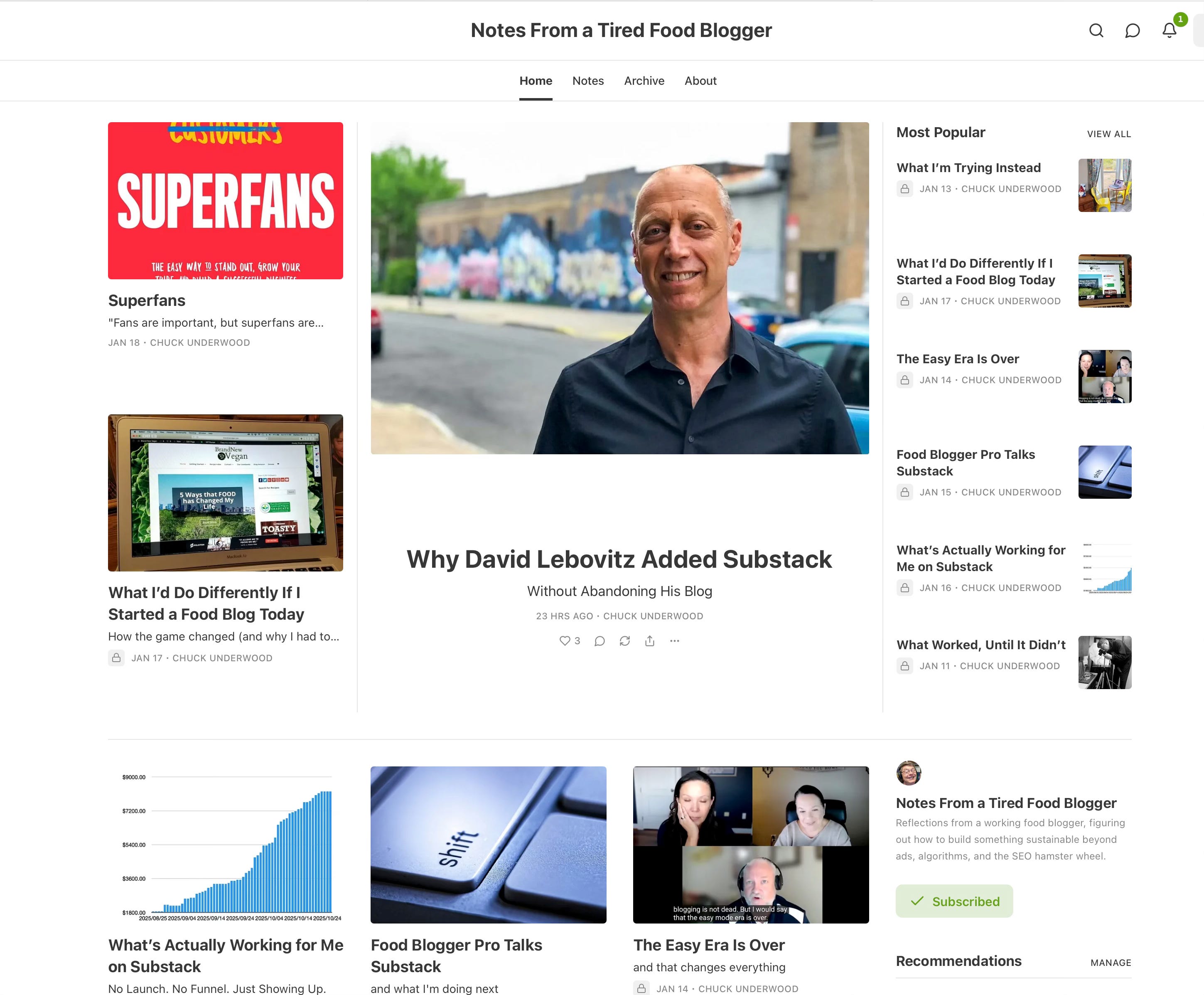
Now switch to reading Substack in a browser and suddenly:
it looks like a website
there may be a homepage
there can be menus and sections
older posts are easier to browse
the layout feels intentional
From the reader’s side, this feels familiar—especially if you come from blogs.
In the browser, a reader can:
click around
see categories (if the writer uses them)
view an archive
understand the structure of the publication
This is where Substack feels less like an app and more like a traditional website with a newsletter attached.
Same Content. Two Very Different Experiences.
Here’s the key idea most people miss:
The app and the browser show the same writing
but not the same context
Nothing is missing in the app.
Nothing is “extra” in the browser.
They’re just answering two different reader needs:
App: “What should I read right now?”
Browser: “What is this publication about?”
Why This Confuses New Readers (and Causes Panic)
Readers often say things like:
“I can’t find your older posts”
“I don’t see your menu”
“This looks different on my phone”
They’re not wrong.
They’re just:
reading in different places
expecting a website when they’re in an app
or expecting an app when they’re on a webpage
Once you understand that, most confusion disappears.
The Simple Reader Rule
If you want:
easy reading & discovery → app
context, structure & browsing → browser
Neither is better.
They just serve different purposes.
Why This Matters (Especially for Food Bloggers)
If you’re used to blogs:
categories
recipe indexes
navigation menus
homepage layouts
Those expectations live in the browser experience, not the app.
Substack didn’t remove websites.
It just stopped forcing readers to deal with them every time they read.